Loom Teardown: Unraveling Homepage Tactics for Impact
Homepages have many purposes. The main two are attracting your users (SEO) and getting them to use your product. Even small improvements can lead to huge impact on your top line metrics.
Imagine your website homepage as the lobby of a grand hotel. It's where guests (or in this case, users) get their first impression, acquaint themselves with what's on offer, and prepare for their journey ahead. Just like a well-designed lobby sets the tone for a memorable stay, your homepage plays a crucial role in defining your brand's identity and enticing visitors to explore further.
At the forefront of your digital presence, homepages serve as the gateway to your brand. They offer a glimpse into your offerings and provide compelling reasons for visitors to linger, perhaps even becoming paying customers down the line.
The potential for optimization through A/B testing on homepages is huge. With the highest volume of traffic often directed here, changes yield rapid insights. Having evaluated numerous homepages as both a founder and product manager, I've identified key elements that many successful brands leverage.
In this newsletter, I'm tearing down the homepage of Loom—a company that has uses both conventional structures and innovative tweaks.
Navigation Bar: A critical component for both user experience and SEO strategy, the navigation bar showcases vital sections for easy access. While many opt for a visible layout such as Miro's comprehensive bar, Loom adopts a sleek approach with a collapsed menu. While i’m not sure about its impact on SEO, it enhances the design aesthetic, allowing users to focus on the primary message and calls to action.
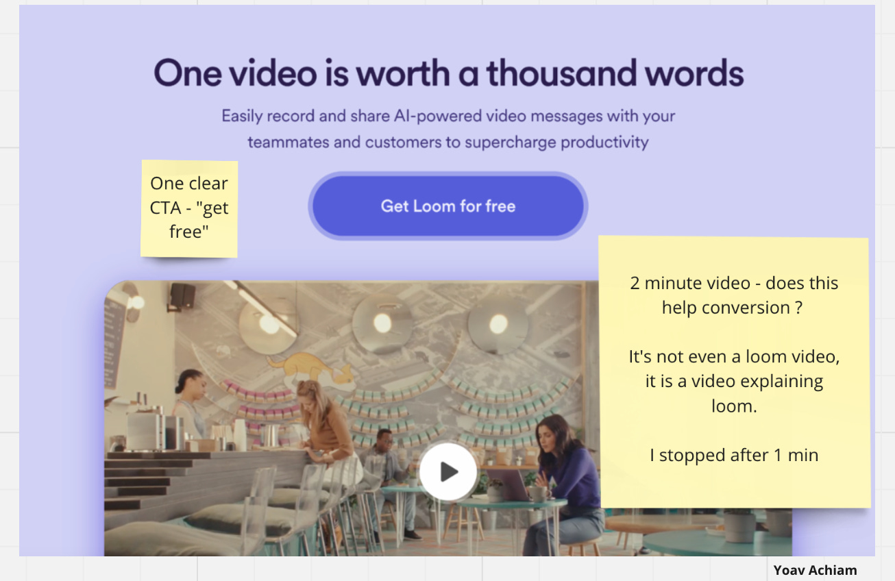
Main Message: The headline, subtitle, and primary call to action serve as the homepage's core. A concise encapsulation of your business's essence. Loom adeptly communicates its value proposition, emphasizing the superiority of video over text or images while highlighting the free accessibility of its platform. Next Loom showcases a video explaining the journey of someone unfamiliar to Loom. It isn’t a Loom video, but rather a video ABOUT Loom. This is a missed opportunity to showcase how easy it is to record a Loom.
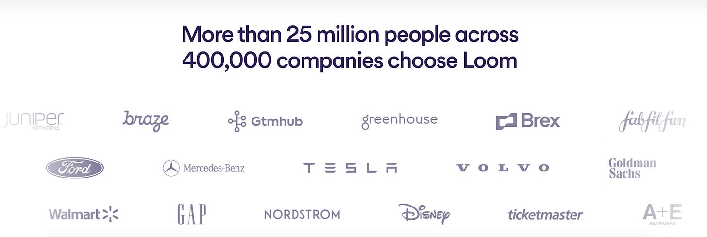
Social Proof: Establishing credibility through social proof is crucial. Loom strategically integrates two sections - one prominently positioned after the introductory video and another at the page's conclusion. This reinforcement fosters a deeper connection with the brand, instilling confidence in potential users.
New Feature: Loom introduces a fresh approach by spotlighting a new feature. This dynamic element signals ongoing innovation and encourages user engagement, potentially driving adoption of the latest functionalities.
Use Cases: From basic functionalities to advanced features, Loom navigates users through its offerings seamlessly. Emphasizing simplicity as its core strength, the platform transitions from recorder to collaborative tool, catering to diverse user needs effectively.
Final 'Hail Mary': A common yet effective tactic, Loom concludes its homepage journey with a compelling call to action, enticing users to "Get Loom for free." This strategic placement capitalizes on visitors' interest, converting intent into action.
Additionally, Loom implements less conventional strategies worth noting:
Blog Integration: By featuring a dedicated section for their blog, Loom enhances SEO visibility while providing users with valuable content, even if it's not immediately accessed by all visitors.
Internal Links: Embedded within use case sections, internal links serve dual purposes—potentially boosting SEO and enriching user experience by offering additional relevant content.
In conclusion, prioritize crafting a compelling headline, subtitle, and primary call to action while ensuring your homepage is optimized for both SEO and user engagement. Experiment with key elements, and don't hesitate to incorporate unconventional strategies to stand out in the digital landscape.


